Shannon Brinkley Studio Blog

How to Make your Quilt Pattern POP! Mar 16, 2021

Ever planning your fabric for a project and ask yourself:

How can I make this section POP?

Today we're talking about the magic little tool called temperature!

There are warm colors and cool color...

Continue Reading...
How to use that Fun, Large Print? Feb 24, 2021

Do you have any fabrics in your stash that are super cute, but you have no idea how to use them? 

This is SUPER common. We see these cute, large-scale prints at the fabric shop and just have to have ...

Continue Reading...
Print Mixing: How to Mix Wild Prints in your Quilts Feb 10, 2021

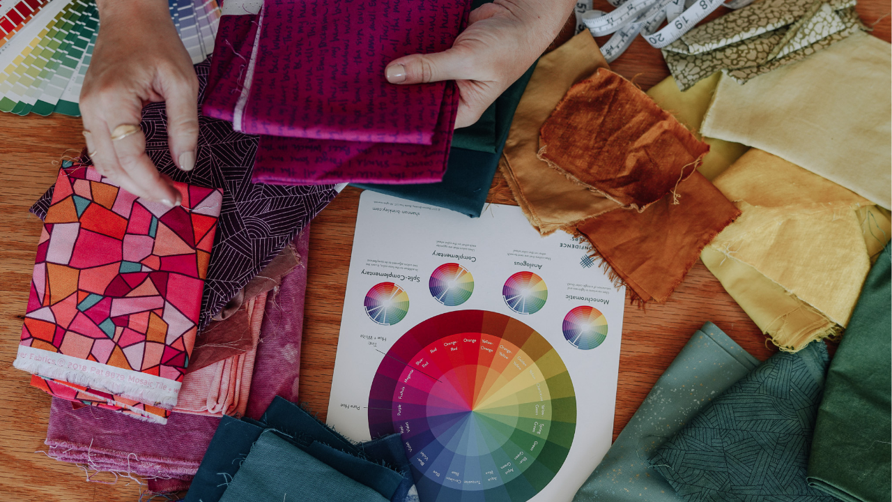
I've taught color to thousands of quilters from all around the world, and a common struggle I hear from them is around Print Mixing. 

How do you pair different prints from different fabric collection...

Continue Reading...
Build a subtle color palette that pops! Dec 06, 2018

I teach quilters from all over the world and one problem I see them struggling with over and over is -- what fabrics should I choose for my projects?!

Whether you've been quilting for years or just s...

Continue Reading...
What is Your Quilter's Color Style? Take the Quiz! Aug 29, 2018

I teach quilters from all over the world and one thing I get asked about over and over is about COLOR! So I decided to make fabric selection a little easier and created this Quilt Color Style Quiz! Yo...

Continue Reading...
Violet and Gray: A Cool and Eerie Palette Apr 10, 2018
I love these violets and purples alongside these cool grays. It makes for a stark, almost eerie palette. Perhaps it's only eerie since it is made into a giant octopus... who can say?
 
 
Not all ...
Continue Reading...
How to Use Warm and Cool colors in your Quilt Apr 03, 2018
One of my favorite tools that I keep in my fabric selecting toolbox is-- temperature! 
 
A color can be described as warm or cool. Generally, yellows, oranges, and reds are considered warm, while bl...
Continue Reading...
How to Brighten up a Dull Color Palette Mar 28, 2018
Have you ever been making a quilt, and while you're loving the fabrics you've chosen, the overall palette is looking a little dull? 
 
This happened to me while I was making this London Skyline quil...
Continue Reading...
How to add Pops of Color to your Quilt: Part 3 Jan 23, 2018
Have you ever been pulling fabric for a quilt, and thought, how can I make this look more interesting?
 
 
One of my favorite ways to make a color palette instantly more interesting is to add a P
...
Continue Reading...
How to Add Pops of Color to your Quilt: Part 2 Jan 16, 2018
I travel all over the country teaching, and a question I get asked a lot is HOW do I add a pop of color to my quilt? How do I know which color to choose for the pop? 
 
 
 I LOVE adding a pop of
...
Continue Reading...
Color Inspiration: Aqua, Blue, Purple, Gold Oct 10, 2017

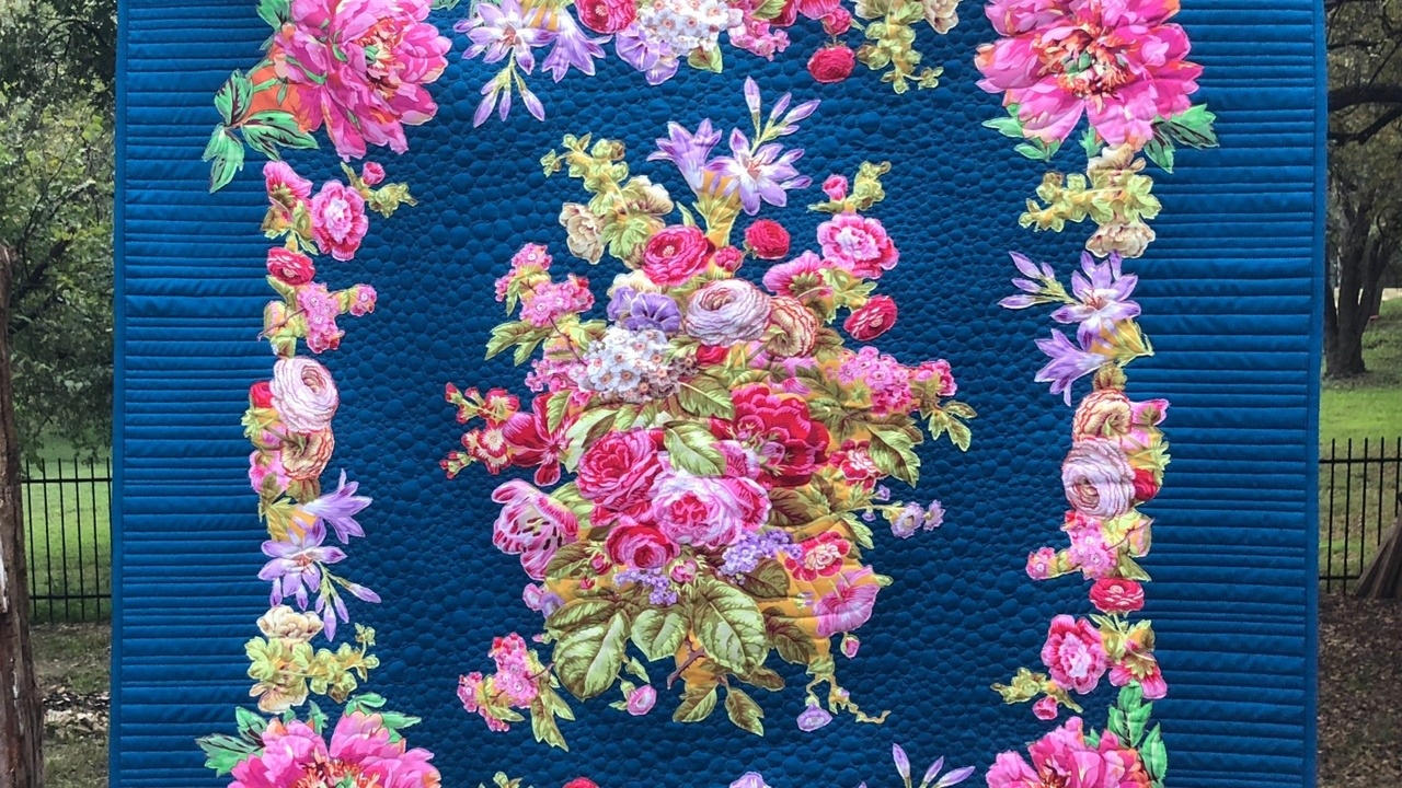
When choosing fabric for this quilt I started with several different mints and aquas, dropped in a bright blue, gold, and purple, with black and white accents. I think those blue, gold, and purple pop...

Continue Reading...
Color Inspiration: Blue, Mint, Orange, Magenta Sep 26, 2017

Here is a little color palette inspiration for you! The quilt is made up of all Northcott Solids, but for the fabric pull below, I included some prints so you could see how prints would look in this p...

Continue Reading...
1 2