Build a subtle color palette that pops!
Dec 06, 2018I teach quilters from all over the world and one problem I see them struggling with over and over is -- what fabrics should I choose for my projects?!
Whether you've been quilting for years or just started, you are not alone in this struggle! Because of this, I like sharing strategies and ideas around different effects you can create in your fabric palette and how to pull it.
Today the effect we're creating is a soft, cool palette with a little pop!
For this project, I knew I was making a Snowflake Applique Piece (get the free pattern here), so I wanted it to be soft, icy, but still have a little pop.

So I started on the cool side of the color wheel with blues and aquas, choosing lots of light blues, turquoises, and aquas. Since these colors are right next to one another on the color wheel, they are going to go nicely together-- lots of harmony.

But since there was so much harmony (no surprise jolts) with that palette, I wanted to add a little pop.
The further colors are away from one another on the color wheel, the more contrast there is (i.e. the more POP).
I knew I wanted to add a little contrast but not TOO much, so I didn't go directly opposite blues/aquas on the color wheel for my pop of color, but almost. I dropped in the rich, saturated orangey-gold, which adds depth and that fun pop of color.

SO if you're wanting to create a soft, harmonious palette with a little pop of interest, this might be a good "formula" to follow: light-medium fabrics close to one another on the color wheel, then drop in a pop of color from the other side of the color wheel (doesn't have to be directly opposite).
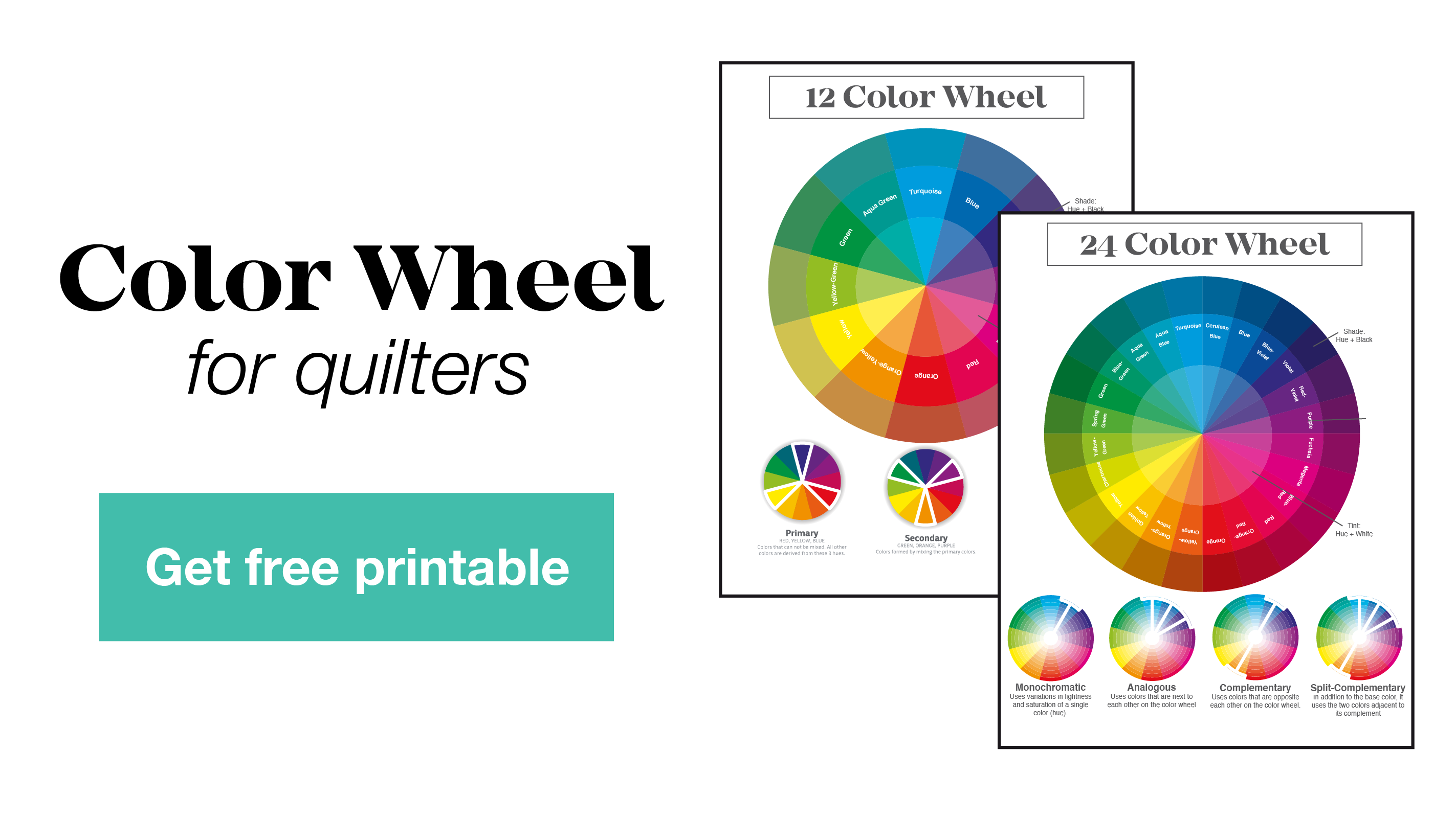
Need a Color Wheel for your studio to help with fabric selection? You can download my free color wheel below.