How to Use Warm and Cool colors in your Quilt
Apr 03, 2018One of my favorite tools that I keep in my fabric selecting toolbox is-- temperature!
A color can be described as warm or cool. Generally, yellows, oranges, and reds are considered warm, while blues, greens, and violets are considered cool.

Now, warm and cool colors behave quite differently. Warm colors stand out while cool colors recede. This is a powerful piece of information because we can use this trick to create some interesting effects in our quilts!
I'd like to share with you 2 tricks that temperature can help you play.
1. The Warm POP
If there is an element in your quilt that you want to really POP, think about choosing a warm color for that element and surrounding it with a cool color. (Check out my article on Choosing the Perfect Ground Fabric for more on this). Here are some examples of this trick.

All three of these tea towels have a warm appliqué piece. The swan and hummingbird are both placed on a cool background, making them really stand out (as much, if not more-so, than the horse on the neutral cream background).


I love what a statement this gold globe makes on the cobalt background. Not only does temperature help the globe to really pop, but value does too (value is the darkness or lightness of a color). The light warm globe really contrasts and stands out from the cool, dark background.

For this quilt, temperature plays a huge roll. The background is relatively busy, but the fact that the deer is warm and the background is cool, allows the deer to pop, even on a busy background.
2. Creating Balance
If instead of a pop, you'd like your quilt to look more balanced, temperature can help you with that. Using both warm and cool colors in your quilt will automatically make your color palette look more dynamic and balanced than if you only used one or the other, but the placement of those warm and cool fabrics can create balance in your design. Since cool colors recede, using a cool fabric as the prominent element in your quilt with a warm background will help create balance. No one part of the quilt will stand out much more than another.

In this Wandering Bear Quilt, the cool bear placed on the warm, pieced background creates a lot of balance. I think if I had reversed the colors and made the bear orange and the pieced background blues and greys, there would be a very different effect. The orange bear would stand out much more, and the blue bear claws would be a lot more subtle. This could have been a neat effect, but I wanted both the appliqué piece and the bear claw blocks to play equal rolls in this design.
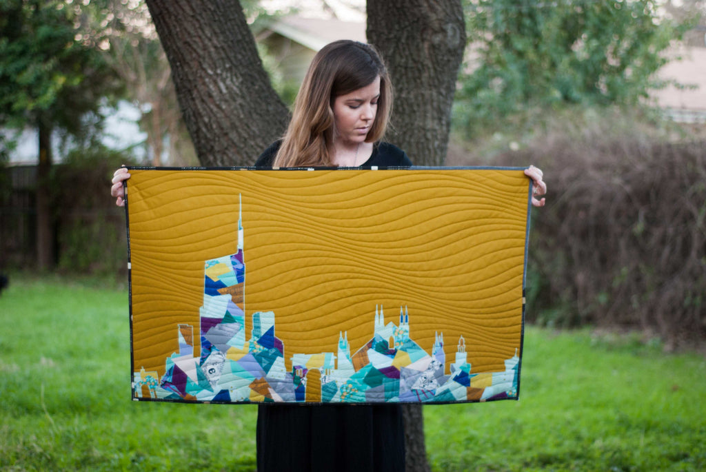
Here is another example of balance. The cool Milan Skyline doesn't stand out, rather, it recedes into the warm gold background. This creates a lot of balance between the background and the foreground.
There you have it! Two different neat effects you can create using that powerful tool-- temperature.