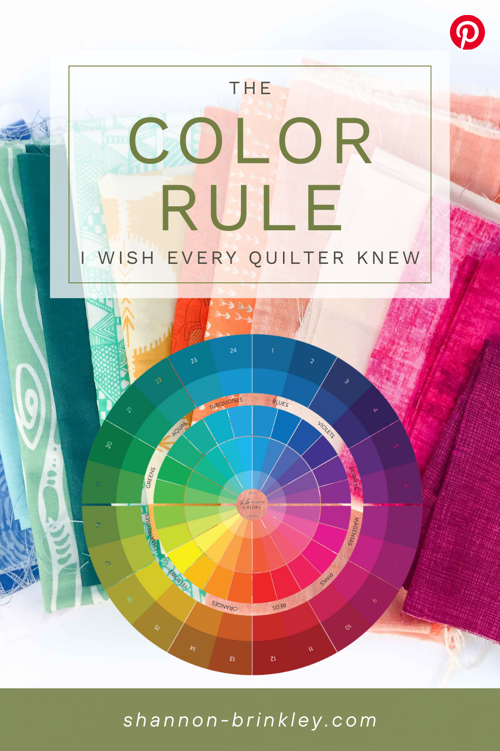
The Color Rule I Wish Every Quilter Knew
Dec 10, 2025If you’ve ever stood in a fabric shop, holding bolts of color and thinking…
“Do these colors clash?”
“Is this allowed?”
“What even goes with purple?!”
You are not alone — and you’re not doing anything wrong. Most quilters were taught color rules as if there were “right” and “wrong” combinations… but here’s the truth that completely changed everything for me: there are NO forbidden color combinations.
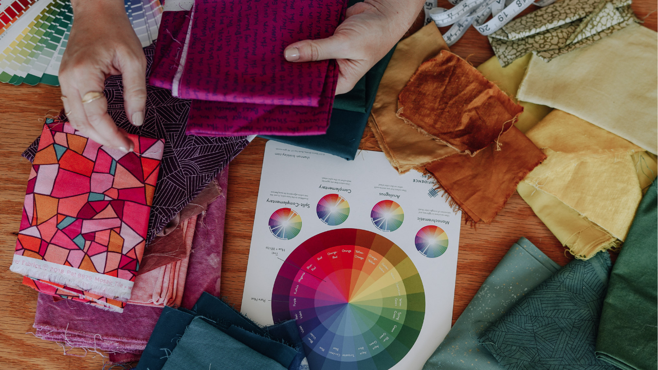
Any hue can work with any other hue — the real question isn’t what goes with what, it’s: How much harmony or contrast do I want to feel in this project? I'll walk you through exactly how to discover your personal color balance using the color wheel — and once you understand this framework, you’ll never stress over color choices again.
What You’ll Learn in the Video
-
Why any hue can work with any other hue (when tone is aligned)
-
How the color wheel reveals natural harmony and contrast
-
The full Palette Spectrum—from minimal and serene to playful and bold
-
How the same quilt design feels completely different in different color moods
-
The simple Magic Formula for choosing palettes confidently every time
Watch the Full Lesson Here
The Palette Spectrum
Your color choices live on a beautiful, flexible spectrum — there’s no “correct” spot to be on it. Each project simply asks for a different mood.
Here’s how the spectrum breaks down:
Monochromatic — Maximum Harmony
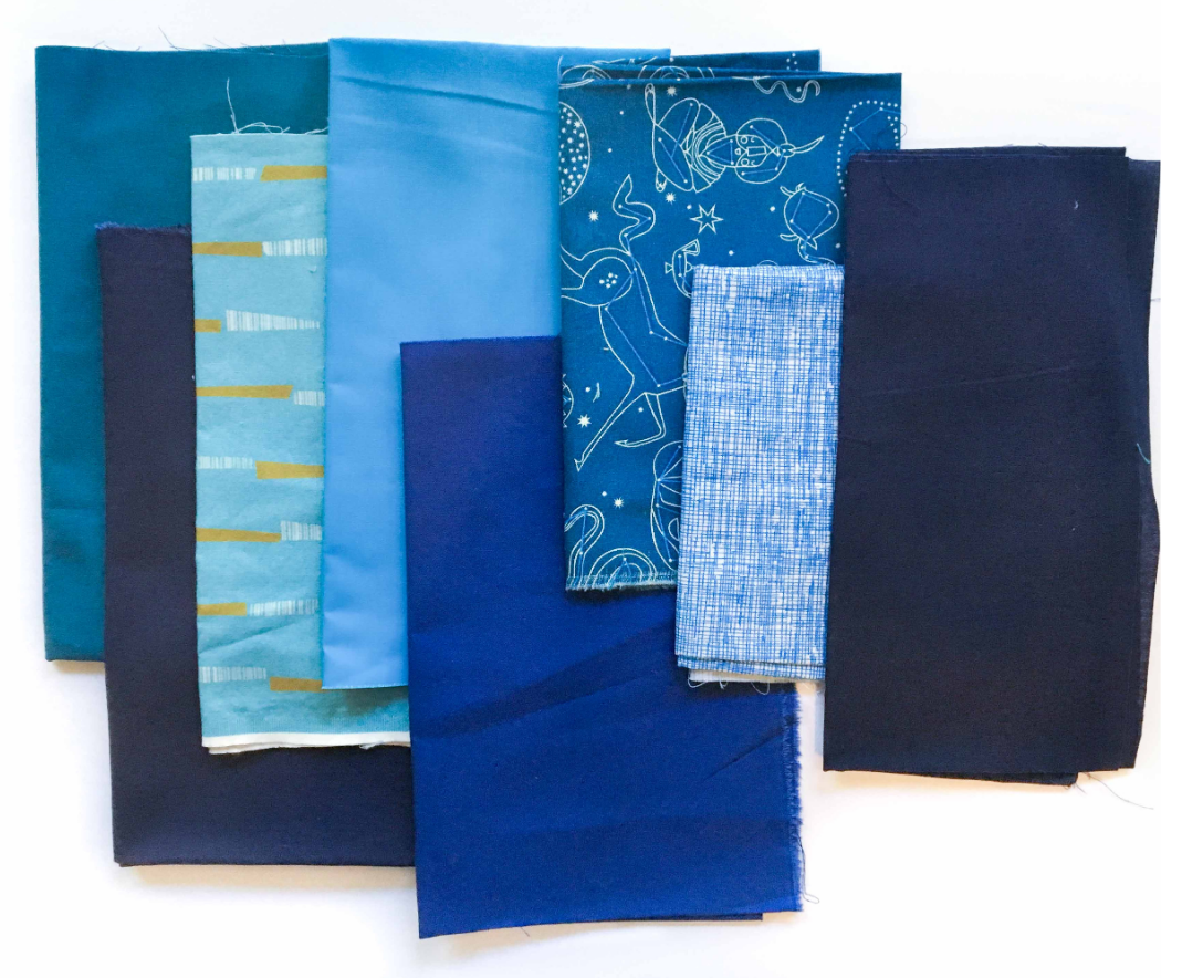
-
One hue in light, medium, and dark variations
-
Peaceful, serene, and elegant
-
Keeps the viewer’s focus on the design rather than the colors
Monochromatic quilts often shine when:
-
You want a quiet, timeless look
-
Your pattern itself is visually strong
-
You’re craving minimalism or calm
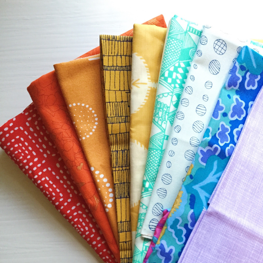
Subtle — Gentle Contrast
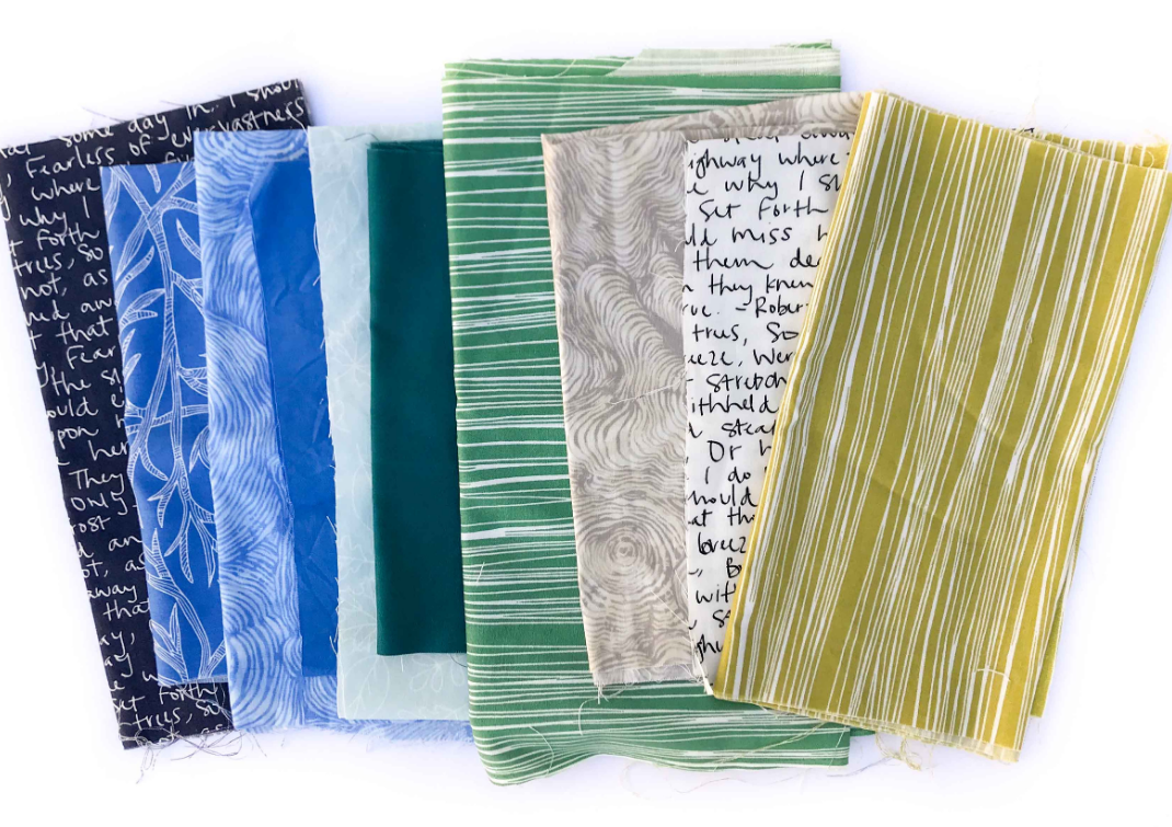
-
Colors next to one another on the wheel
-
Soft flowing transitions
-
Natural and balanced
Examples: blues with teals, chartsreuse with greens
This palette creates movement without visual noise — great for quilts that want just a hint of playful color interaction.
Contrasting — Bold Energy
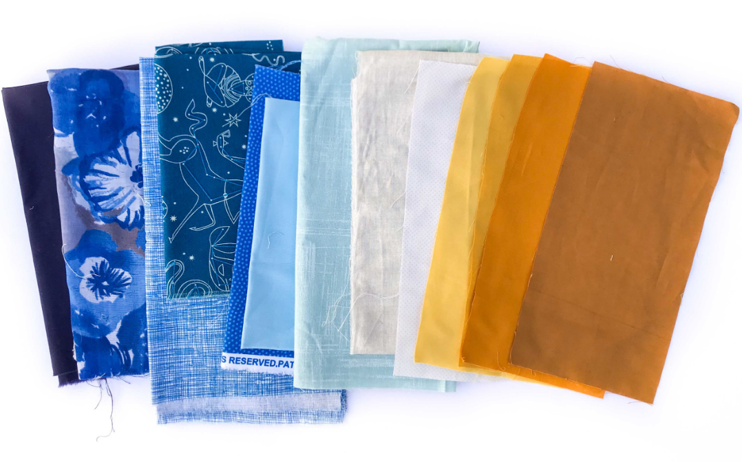
-
Opposites on the color wheel (like blue and orange)
-
The highest contrast combination possible
-
Creates vibrancy and impact
Colors become more intense when placed next to their opposites:
-
Blue looks bluer next to orange
-
Orange looks richer beside blue
Use contrast when you want the quilt to:
-
“Pop” across the room
-
Feel bold and expressive
-
Have high emotional energy
Dynamic — Playful Balance
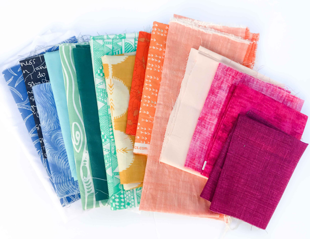
-
Multiple colors pulled from around the wheel
-
Contains both warm and cool tones
-
Complex, joyful, layered
Dynamic palettes feel artistic and adventurous. These are perfect when:
-
You want lots of visual excitement
-
You enjoy mixing many color families
-
Your quilt is meant to feel dynamic and joyful rather than subdued
Rainbow — Maximum Joy
-
All hues welcome — nothing held back
-
Explosive color celebration
-
The ultimate playful palette
If your heart says:
More color is always better!
This might be your comfort zone.
Same Pattern — Totally Different Moods
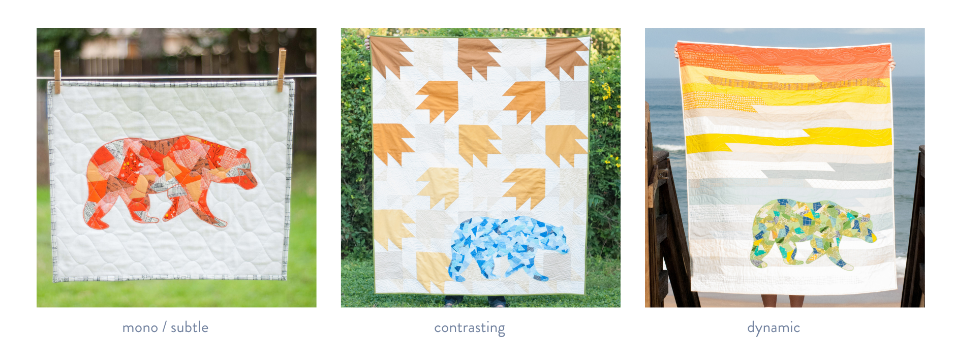
Here’s what’s truly powerful: The same pattern can convey entirely different moods depending only on the palette used:
-
A monochromatic version feels calm and sophisticated
-
A contrasting palette feels bold and graphic
-
A dynamic palette feels playful and energetic
Color alone completely redefines the emotional experience of the quilt.
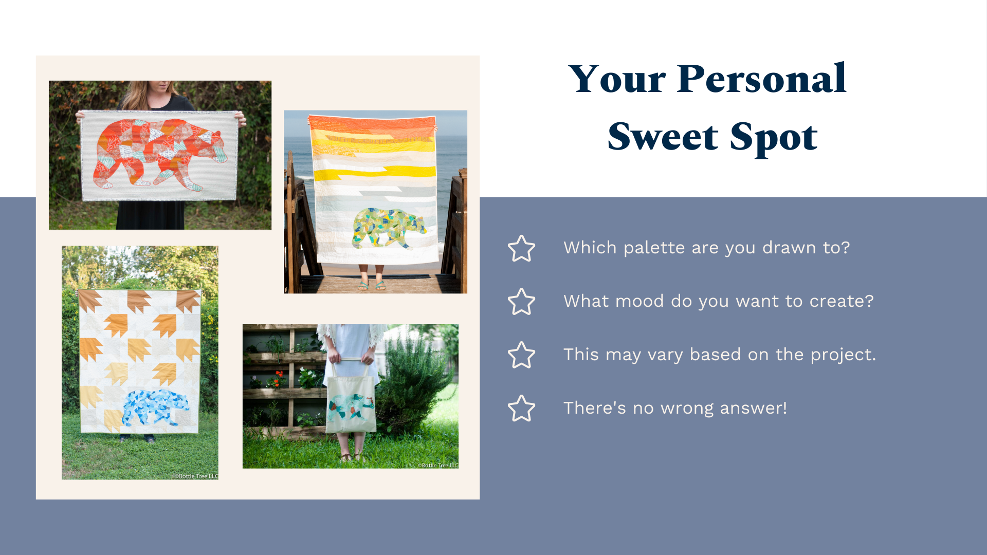
Your color confidence grows when you learn to ask two simple questions:
1. Which palettes are you drawn to naturally?
Monochromatic?
Subtle?
Contrasting?
Dynamic?
Rainbow joy?
There is no wrong answer — your preferences reflect your creative voice.
2. What mood does THIS project want to create?
-
Soft & serene?
-
Bold & dramatic?
-
Lighthearted & playful?
-
Artistic & layered?
Your palette may change from project to project — that flexibility is part of creative growth.
Try This at Home
Here’s your simple homework:
Look at your fabric stash (or even your wardrobe!)
Ask yourself:
-
Where do I land naturally on the harmony–contrast spectrum?
-
Do I tend to go subtle or bold?
-
How would I shift if I wanted to try a new mood?
This awareness alone will start transforming your quilts.
And to help you start immediately…
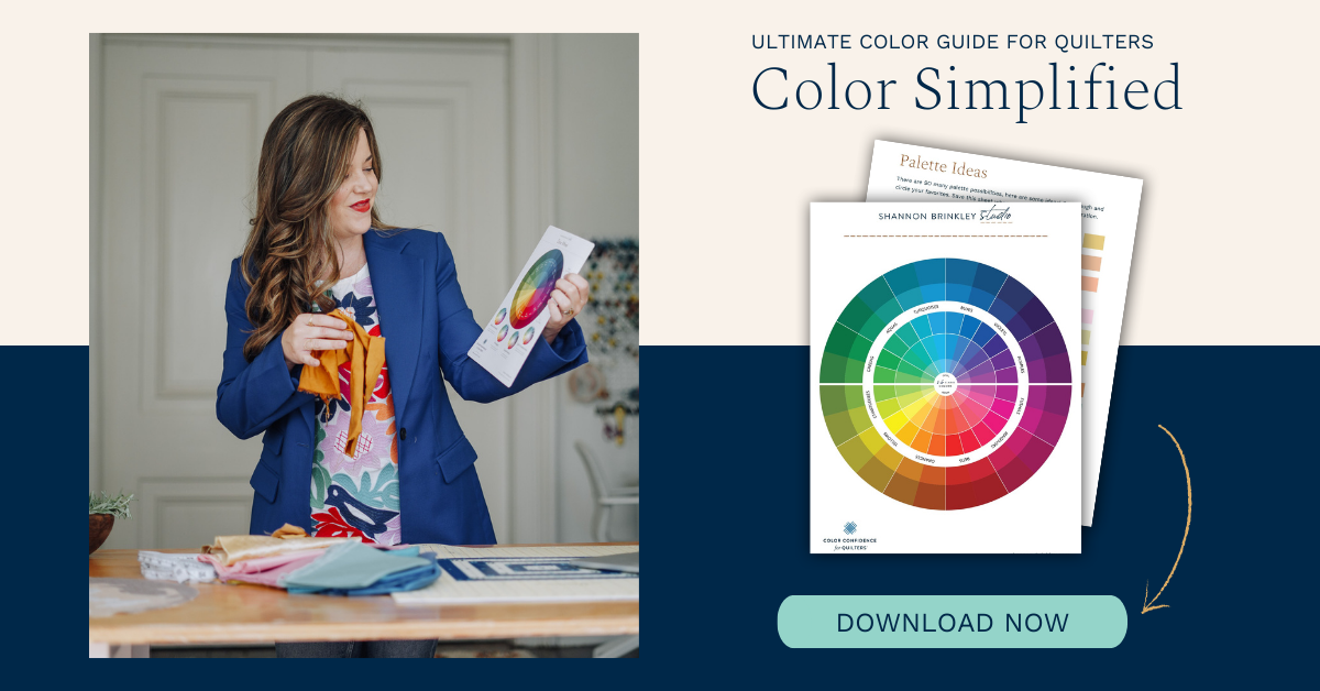
FREE DOWNLOAD
Find Your Color Style Guide + Color Wheel
Want to Go Deeper?
This video is just the beginning. Inside Meander — My Online Quilt Guild, I teach a complete Color Confidence Curriculum where we explore:
-
Hue relationships
-
Value control
-
Saturation shifts
-
Print mixing strategies
-
Building your personal signature color style
I’ll see you in the next lesson — and remember: Any hue can work with any other hue. The only question is how much harmony or contrast makes you happy.