How to Add a Pop of Color to your Quilt: Part 1
Jan 10, 2018The Analogous Pop of Color
An analogous color palette contains colors that are next to one another on the color wheel. (You can learn more about analogous palettes here.)
Colors that are next to one another on the color wheel are similar, they share some of the same colors (like green and blue are next to each other on the color wheel, and green contains blue) so they are going to be harmonious. So adding an analogous pop of color will be subtle and not jarring.

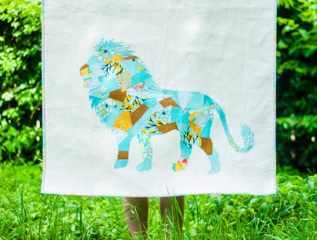
SO to insert an Analogous POP, simply start with a monochromatic palette (as you can see below, I started with blues, and to keep it interesting, I varied the values of those blues, including lights and darks.)

Then I chose a color near blue on the color wheel -- this chartreuse green. In the quilt, I included the chartreuse only in little pops, notice there is just one little piece in each bird, and the pieces are relatively evenly distributed.


Did you enjoy this article? Be sure you are signed for email updates so you can see the rest of this mini-series!