Have you ever looked at a quilt top you've assembled and thought, hmmm this is kind of boring... the design doesn't look nearly as interesting as it did on the pattern!
There is a tool that every good quilt designer has in his or her belt-- that tool is the understanding of color value. Value is the lightness or darkness of a color, and when used well, can create depth, emphasis, and add a lot of interest. If our entire quilt is made up of one value, likely that top looks boring or the design is completely muddled. The problem is that value can sometimes be tricky to see, especially when we are using different colors and prints. Luckily, like hue, value is something we can train our eye to see-- it is a tool we can learn how to use.
This is the 6th lesson in the color series I've been doing, Color Confidence for Quilters. If you missed any of the previous posts, you can find the links below. If you enjoy this article, be sure to sign up for email updates at the bottom of this post so you don't miss the other lessons in this series!
Color Confidence for Quilters:
Color Value
The past several weeks, we’ve been exploring different classic color palettes. Now that we've covered palette possibilities, let's dive into ways to play with those palettes to create really interesting results. Understanding color value and how to use it can drastically improve your quilt design skills!
Color Value refers to the lightness or darkness of a hue.

HOW TO PLAY WITH VALUE
There are a lot of fun and simple ways you can use value in any color palette. Below are a few ideas as well as things to keep in mind.
Tip: Think about Contrast
Value can create contrast. Pair two high or low value fabrics together, and you get a gently, low contrasting effect. Pair a low value fabric with one of high value, and you end up with a much more bold look. You can even place values in a certain order for some fun effects.
Tip: Use Value for Emphasis
Is there an element (block, part of a block, or appliqué piece) in your quilt pattern that you want to make stand out? You can emphasize different parts of the quilt with value. Do you have a dark appliqué piece you'd like to show off? Then place it on a light background. Making a star block and really want the star spokes to stand out? Make the spokes light and the surrounding pieces dark (or vice versa). Surrounding the area you want to show off with fabrics of a very different value will draw your eye right where you want it.
Tip: Use Value to Create Balance
To create a balanced design, choose fabrics with a variety of values (some lights, some mediums, some darks) and try to distribute the values relatively evenly in your design.
PRACTICE
The Exercise: Order the Values 
Value is one of the 2 magic dials that you can turn up or down and can make ANY colors work together. But before we can wield this magic dial, we need to be able to distinguish darks from mediums from lights. This can be trickier than it seems, and this exercise will be beneficial even to color pros. Download the free Gray Scale tool below to help with this exercise!
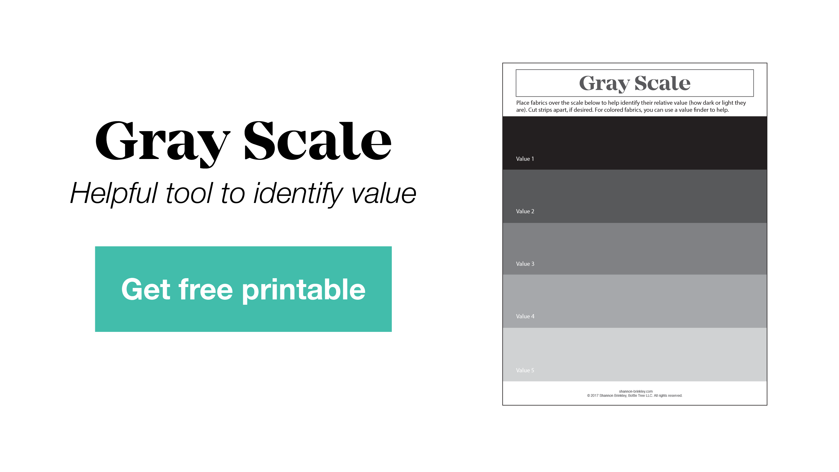
Start with blacks, grays, and whites.
- Pull a pile of these from your stash and separate them into 3 piles: light, medium, dark
- Place your lightest fabric on one side and your darkest fabric on the other.
- Start ordering your other fabrics -- start with lights, move to mediums, then your darks. Use the Gray Scale to help.
How did it go?? Harder than it seems, right? If you had any trouble with this, you might want to grab yourself a
Value Finder
or
Value Finder Glasses
(I have a pair and use them all the time!). Often when I'm laying out quilt blocks, I'll put them on to make sure the value is balanced before I sew them together. I like to use my value finder glasses with the Gray Scale printable anytime I'm sorting values.
Next try a single color, like blue or green. Repeat the steps above with a color.
Want more of a challenge??? Try grabbing fabrics of different colors and placing them in order. This is really tricky!
Don't stress about perfection, just order them the best you can. It is easy to identify white as "light" and black as "dark, but when we start bringing in different colors and prints, that is where distinguishing value can get tricky. Just like identifying hues, value is something we can train our eye to see. (I used my value finder glasses to help me sort these fabrics.)
The more you pay attention to value, use tools like value finders or the Gray Scale printout, and play with values in your palettes, the better you'll get at seeing/creating balance in your quilts.
Stay tuned as we continue to learn about how color works, especially as it related to quilting. Next week we'll have another color palette inspirational nugget post, then the following week, we'll learn about the second "magic dial", saturation!
Be sure to subscribe below to get the rest of this color series sent to your inbox!
Now, I’d love to hear from you! Did you find this helpful? Do you think about value when constructing your quilts?
Want more Inspiration?
Get free patterns, tutorials, & updates delivered to your inbox.