Color Confidence for Quilters-- Part 2: Monochromatic Color Palettes
May 31, 2017I teach workshops all over the U.S. and hear over and over from quilters that they struggle knowing what colors go together. They struggle to pull a color palette for a project and often only feel confident about their fabric selection if it is from a kit, precut, or all from the same fabric collection.
If that sounds familiar, you are in the right place!
There are 2 key traits that play into being able to pull together an original color palette that you love and know looks great: science + intuition -- knowledge of how colors work and strengthening your color intuition, or your "eye for color".
In this series, Color Confidence for Quilters, we are exploring/growing both of those elements. Every other week, we'll have a lesson about how colors work (also called Color Theory), and the weeks in between, we will be training our "eye for color" and building color palettes using inspiration photos. If you missed the first 2 posts, you can find them below.
Color Confidence for Quilters:
- Lesson 1: The Color Wheel
- Inspirational Palettes 1: Seeing the Subtle Hues in Nature
- Lesson 2: Monochromatic Color Palettes (This post!)
Classic Color Palettes: Monochromatic
Over the next few weeks we will be learning about and exploring examples of classic color palettes. First up, the seemingly simple, but extremely versatile, Monochromatic Palette.
Mono- prefix meaning 'one' chroma- referring to color
A monochromatic color palette is made entirely from a single hue.

SAMPLE PALETTES

HOW TO USE THIS PALETTE
There are so many different and fun ways you can use a monochromatic palette. Below are 5 different effects you can create from the same palette of blues by playing with the values. Remember, value is the lightness are darkness of a color. You can create really different effects by pairing different values together or by arranging the values in a particular manner.
Tip: Play with Value!

Tip: Pair a Monochromatic palette with neutrals.
Below are 4 different quilts I've made using a monochromatic palette. The Kraken quilt in the bottom left is made of a bunch of purples and grays and is placed on a light gray background. These fabrics make for a moody, murky underwater look.
The bear in the upper left is made from a bunch of different greens, but I've also included a few neutrals -- there is a black and white print in the bear along with a cream, and the background is a light coffee color. I also included a fun multi-colored print, which is my next tip.
Tip: Include a multi-colored print that contains the color from your monochromatic palette. The other colors in it will add fun & subtle pops!

PRACTICE
The Exercise: Pull a Monochromatic Color Palette
 This should be super easy if you did the exercise from the lesson (Organize your Stash).
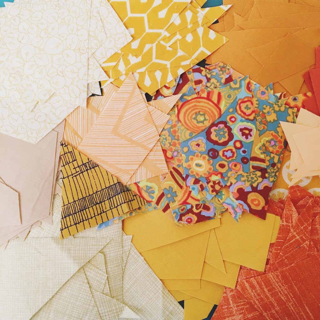
I love including a few solids, textured solids, monochromatic prints, and even batiks for a really dynamic palette.

Maybe try to pull an entirely neutral palette...