How to Build a Fabric Palette: Working with Golds
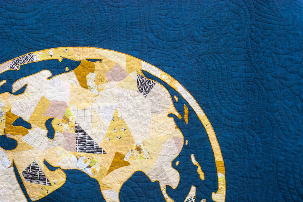
Oct 24, 2017Sometimes a fabric palette will start with one thread of an idea-- sometimes a literal thread. I saw gold embroidery on a dark cobalt fabric, and I knew I wanted to translate that into a quilt. My new GLOBE pattern was the perfect chance to do that!
So I found a really rich, dark cobalt then went digging around in my yellows. Golds can be a little tricky -- they usually will lean a little on the green side or a little on the orange side.

When building a yellow/gold palette, I usually will choose one side or the other, either choosing mostly orangey-golds or greenish-golds. In the bunny and robots below, I chose yellows/golds that leaned a little orange.


And in this NYC skyline, and the GLOBE quilt, I used mostly golds that leaned a little to the green side, with 1 or 2 orangey-golds. These orangey-golds blended well with the greenish-golds, I think, because of that floral print (the same one shown in the fabric selection above) that has both colors in it -- making the two work really well together.

If you are having a hard time seeing the difference between the orange-yellow and the green-yellow, it could be because different computer monitors show colors differently. Also, seeing these subtle differenced in color is something you can lean/develop. Check out my article on the Color Wheel; it describes an exercise to help train your eye to see these subtle differences in color.