Color Confidence for Quilters -- Part 1: the Color Wheel
May 17, 2017I teach workshops all over the country and I've noticed so many of my students struggling with -- color. Most quilters haven't taken a ton of art classes and, in turn, often lack confidence in their color sense, which makes fabric selection tricky! We get in color ruts, going back to the same few colors over and over, or we only feel comfortable making quilts from a kit, jelly roll, or a single fabric collection.
Fortunately having an "eye for color" is not just something you are born with -- it is something you can develop! This is the first in a series aimed to help you train your eye for color, which will make choosing fabric for your next quilt so much easier and more fun!
Now, if you've ever taken one of my classes (or played me in a game of Clue), you know that I treat rules as ... suggestions. Picasso famously said, "Learn the rules like a pro, so you can break them like an artist."
My goal, then, in this series is not to hand you a bunch of rules and rigid formulas for fabric selection, but rather, to give you a firm foundation in understanding how color works, then provide tools, strategies, and practices for developing your "eye for color".
You'll go from a place of wondering, "Hmmm... do these prints go together? Something seems off, but I'm not quite sure what..." to approaching fabric selection with confidence, joy, and playfulness: Confidence in knowing what you've selected looks good because you understand color theory and have trained your eye for color harmony; The joy, pleasure, and delight that comes from pulling that palette that makes you ache a little and dance around; And playfulness in trying new things, and getting out of color ruts.
Let's play with this delicious medium we have-- fabric. And the primary tool in fabric's arsenal -- color! Side note, how lucky are we as quilters that our medium, unlike messy paints or clay, is one we can (and do!) squeeze, drape ourselves and roll around in?
So let us start this journey of exploration and play with a lesson on the basis of color theory -- the Color Wheel. Then we'll start to train our eye with an activity that has been HUGELY helpful in growing my own color intuition and discernment.
Let's dive it!
The Color Wheel
Vocabulary:
- Value -- Darkness or lightness of a color
- Tint -- made by adding white to a pure color
- Shade -- made by adding black to a pure color
- Tone -- made by adding gray to a pure color
- Neutrals -- black, white, gray, and sometimes brown and beige
Color Types:

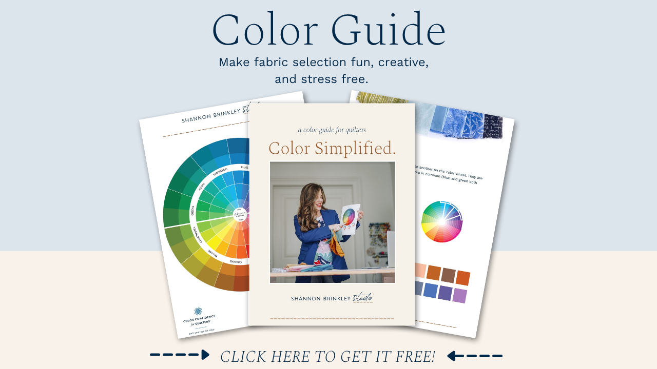
The Color Wheel:
PRACTICE
SO much of fabric/color selection has to do with intuition. That question, "does this look right?" is a question of intuition. Just like great chefs that taste the sauce as they make it -- they intuitively know if they need to add more salt or garlic. A fabric pull is exactly the same.
But that chef didn't come out of the womb knowing how to make a killer marinara sauce. She studies under other great chefs, she spends her life tasting great food, trying new things, noticing flavor combinations she loves. A great quilter does the same thing. She learns the "rules" around color, she plays with new color stories, she pays attention to design and color palettes that really attract or repel her, asking, "what about this is attractive to me?" or "what about this is so unattractive to me?". Then she experiments with those conclusions. Little by little her intuition for color gets stronger, and she is able to pull together gorgeous palettes, just like that chef's sauce. Also like the chef, she will become better and better every year.
Each week I'm going to give you some homework. If you don't already have an "eye for color" these activities will help you develop that eye. I would challenge you to actually do them. Exercises are most effective when you actually do them; we can read about yoga or jogging, but they are going to do little good to reduce our muffin top unless we actually do them. Even if you feel confident in your color selecting ability, I'd wager, unless you've done exercises like this a lot in the past or attended art school, that you'll start to see a change in how you view color the more you do this. You'll start to see the super-subtle differences in colors.
The Exercise: Organize your Fabric Stash
Make a Rainbow
Go through your stash and first separate everything based on the rainbow-- ROYGBV: red, orange, yellow, green, blue, violet (we'll leave out indigo for now). I like to keep my larger cuts of fabric (anything over 1 yd) separate from my smaller cuts of fabric. I also keep my scraps separate. Let's focus on your smaller and larger cuts of fabrics right now and save scrap organization for another time.
You should have 6 separate piles of fabric, one for each color.
Don't have much of a fabric stash? Organize what you have, then move onto your closet!
Break it Down
Now that we've separated our fabrics into 6 colors, let's break it down further. This is where your eye will get it's exercise!
Start with one color at a time, why don't you start with your favorite color or whatever color you have least of -- your pick. Use the Color Wheel to divide that one pile into 2 or 4 piles.

Example: If you've started with blue, separate that into two piles -- blue and turquoise. If that seems challenging enough, stop there. If not, break those down further using the 24 color wheel.
At first, you may have a hard time seeing the subtle differences. If you're stuck on a fabric, debating if it is blue or cerulean blue, just take a guess and move on. We are not looking for perfection. The more you do this, the better you'll get at seeing the distinctions.
Continue this process with your other color stacks.
Once you've finished, give yourself a huge high five (and maybe a glass of wine!), not only do you have gorgeous, organized stacks you can now put away (making the next time you pull fabric for a project, a breeze), but you've started training your eye, like a muscle, to notice subtle distinctions in color.
Our goal is to get you to be able to tell the difference, at a glance, between blue and cerulean blue; between purple and fuchsia; between yellow-green and chartreuse. If your eye is so keen to color that you can see magenta and not just pink, then over time you can see, at a glance, color harmonies. You can pull two fabrics and see intuitively, "yes, this works" or "no, this green has too much yellow in it, I need more of an aqua".
Think you have a pretty good eye for color? Take this cool and quick color test over at the Pantone website.
Next we are going to dive into Classic Color Palettes, so stay tuned! I'll break each one down, share lots of examples, and provide you with some fun color palettes you can use as inspiration.


