
So often when we are choosing fabrics for our next quilt, we jump right to colors, hopefully, grabbing several that make you really happy, but frequently we forget about the quiet, but mightly neutral! Neutrals help your other fabrics to stand out. You can use them to make a vibrant, wild palette look soft and airy (like my tree quilt below). You can add a lot of depth and dimension without adding color by adding charcoal or black. Neutrals can really round out a fabric palette, making it look more complete and dynamic.
But, what are neutrals exactly? And how do I know which ones go with which colors? Aren't all grays basically the same? A beige is a beige, right?
Today we are diving DEEPLY into a serene sea of neutrals! Whether you are a beginner color-wise or feel like you have a really good eye for color, I think you'll find something in this article that will change the way you view these useful fabrics.
Beginner Neutral Rules of Thumb:
There are so many creative ways you can use neutrals, most of which involve paying attention to the undertones of the neutrals and making design choices.
If you are a beginner, in regards to working with color palettes, start with these rules of thumb, then slowly integrate the tips and info below, as you start to become more comfortable with color.
- Grays go well with cool colors (blue, green, violet)
- Beiges/Creams go well with warm colors (red, orange, yellow)

If that is enough info for you right now, stop here -- this is a great place to start.
Picasso famously said that you should "learn the rules like a master, so you can break them like an artist." If you are more comfortable with color, read Neutral Undertones, then dive into the tips below, and learn how to break every rule above to create something interesting and unique.
Neutrals & Their Undertones
Neutrals are typically seen as devoid of color and are variations of black, white, gray, browns, or creams. Most neutrals, though, have undertones of particular hues. Noticing these undertones and being deliberate with the neutrals that you use can make a great impact in your palettes.
*Important: Different computer screens will show color differently, so if you're not seeing the undertones, it could be because of that. Also, noticing the undertones in neutrals is a skill that takes practice-- like noticing hues in our color wheel, you have to train your eye to see these differences, except neutrals are even tougher to discern since they're subtle. The more you work with and pay attention to color, the easier and more intuitive this will become.
Beiges:
When I'm talking about beige, this ranges from a cream, to brown, to butterscotch. These are our warm neutrals, and generally go well with warm colors and earth tones. If you are working with "muddier" tones (think Civil War era prints), beiges usually work better than grays.
Beiges will have pink, green, or yellow undertones.

Grays:
Grays range from a light, hazy gray all the way to rich charcoals. These are our cool neutrals and typically go well with cool colors. Grays really come to life with vibrant, clear colors.
Grays will have violet, blue, or green undertones.

Taupes:
Taupe is a combination of gray and beige, leaning a bit more toward beige. You can find both cool and warm taupes.
Taupes will have pink or violet undertones.

Whites:
White fabric is often not "true white". You can work with a "true white", but a lot of quilters find it too bright and opt for an off-white (same reason most wedding dresses are ivory or "natural" white, rather than stark white). Kona Snow is a good example of "off-white" as it has very subtle yellow undertones.

I created the Neutral Color Wheel below to help you see where neutrals lie on the color wheel and how they are divided by warm and cool tones.
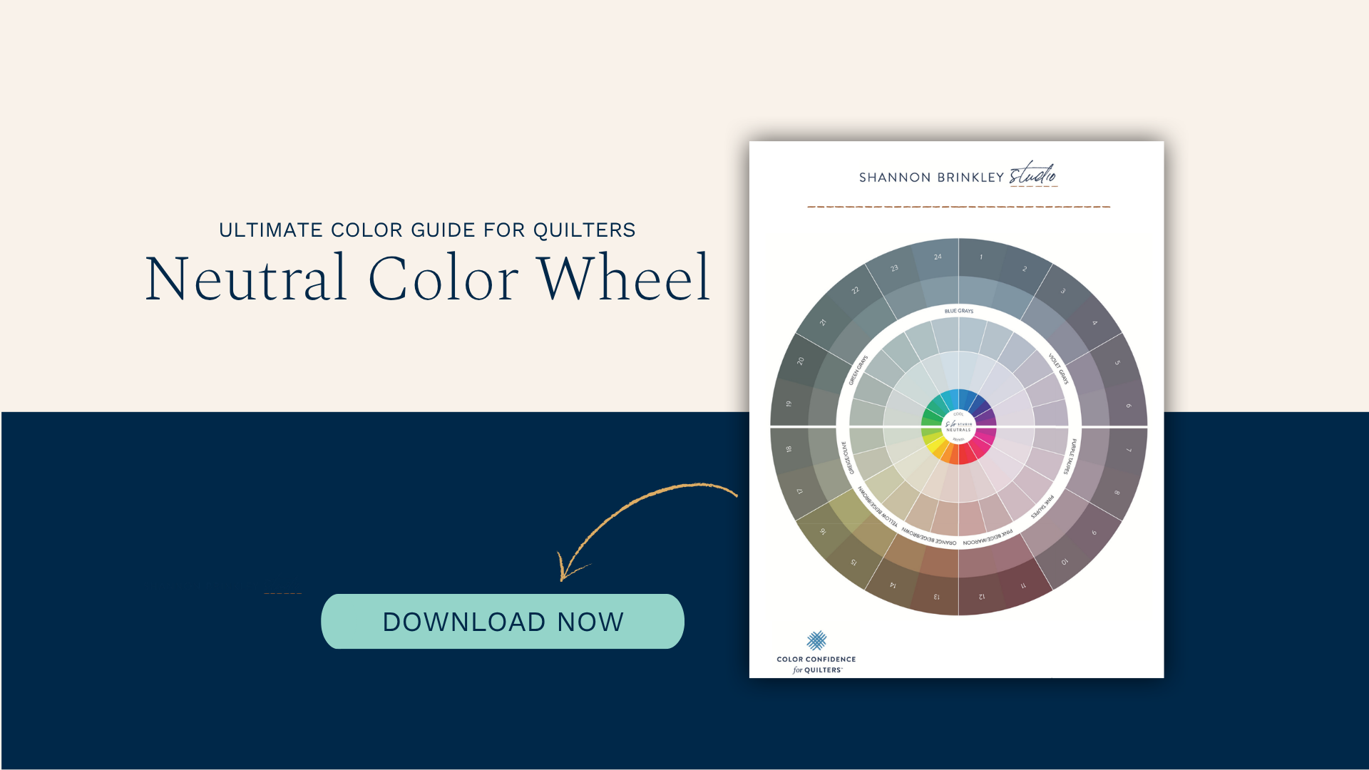
This is just the beginning! In the full article, I'll show you how to work with light and dark neutrals, when to choose warm or cool neutrals, how to confidently mix whites with creams (and even black with brown!), plus practical fabric-sorting exercises that will train your eye to recognize subtle undertones. If you've ever wondered why some color palettes just work, this article will help you see neutrals in a whole new way. Read the full article here →

Responses