
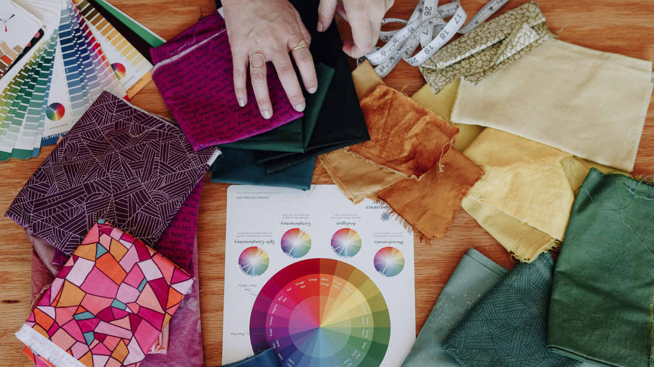
If you've ever stood in front of your fabric stash, pulling out one color, holding it up, putting it back, second-guessing yourself, and eventually walking away without pulling a single thing… I want you to know something.
There is nothing wrong with you.
I teach quilters all over the world, and if I had to name the one thing that trips people up most, it's color. Not because color is actually hard — but because somewhere along the way, most of us got the idea that choosing colors is a mysterious gift you're either born with or you're not. So we stick to the same safe palettes, or we buy the kit so someone else makes the decision for us, all while quietly wondering why we can't seem to trust our own eye.
Here's the thing: an eye for color can be learned. And once you understand one simple idea, choosing colors gets so much easier — and a whole lot more fun.
The secret that changes everything:
Are you ready for it? This is the notion that gives my students the most freedom, so I want you to really let it land:
Any hue can go with any other hue.
Read that again. Any hue can go with any other hue.
Not "these five colors that come in a curated bundle." Not "only the combinations you saw in a magazine." Any hue, paired with any other hue.
Now, there's one small caveat that makes this true, and it's an important one: it's all about the tone. As long as you're choosing colors with a similar tone — similar in how bright or muted they are — any two hues can live together beautifully. So the pressure to find the "right" color to go with your orange, or your teal, or your dusty rose? You can let that go. It was never a real question.
Which brings us to the question that actually matters.
If any hue works, how do you choose?
This is the fun part. Once you know that any color can work, picking your palette comes down to a single, freeing question:
Do I want harmony, or do I want contrast?
That's it. That's the whole decision. And your color wheel is the only tool you need to answer it.
Ask yourself: What do I want this quilt to feel like? Do you want it to feel calm, soft, and cohesive — where the overall design gets to be the star? Or do you want it to feel lively, colorful, full of energy and visual interest? Neither one is right or wrong. It's simply the effect you're going for, and you get to decide.
Here's how the color wheel answers it for you.
For more harmony, choose colors close together
Colors that sit next to one another on the color wheel are like two friends who have a lot in common — they get along easily. Think blue and green (they both have blue in them), or a run of yellows into oranges. Because they share so much, they blend and flow together, creating a soft, harmonious feeling.
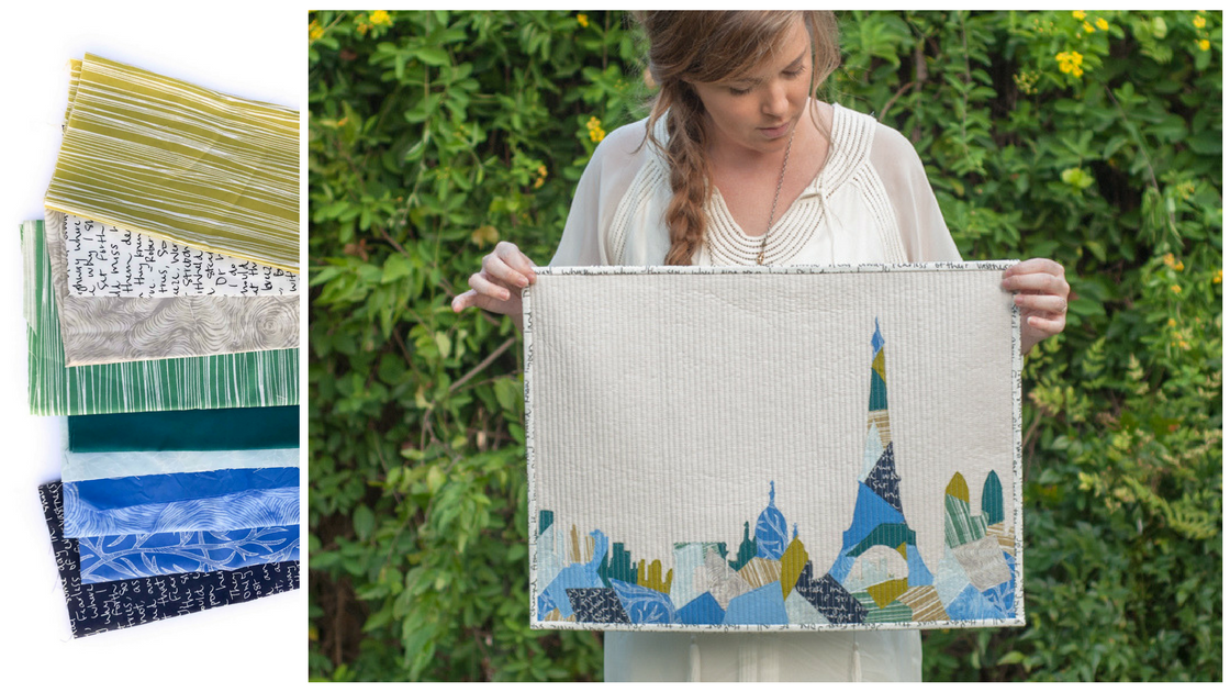
If you want your quilt to feel serene and unified — where the pattern and piecing take center stage rather than the colors themselves — pull hues that live near each other on the wheel.
For more contrast, choose colors further apart
The further apart two colors are on the color wheel, the more they contrast — the more they pop against each other and grab your attention. A palette pulled from all around the wheel is going to feel colorful, energetic, and full of visual interest.
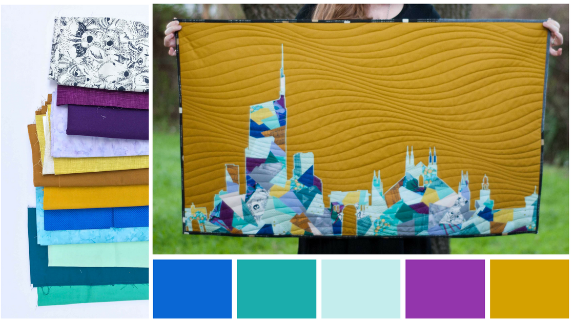
And if you want the most contrast possible? Reach for colors sitting directly across from one another — these are called complementary colors, and opposites truly do attract. They make each other stand out more than any other color could, even more than black or white.
So if you want your orange appliqué to really sing, set it against a blue background. If you want your yellow stars to shine, surround them with purple. That's not a happy accident — it's the color wheel doing exactly what it does.
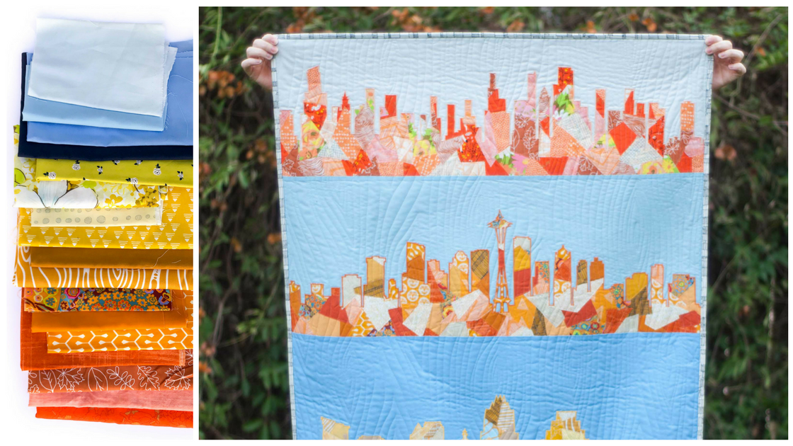
Put it all together
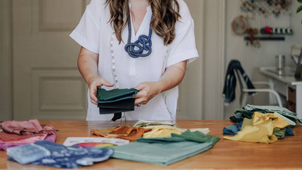
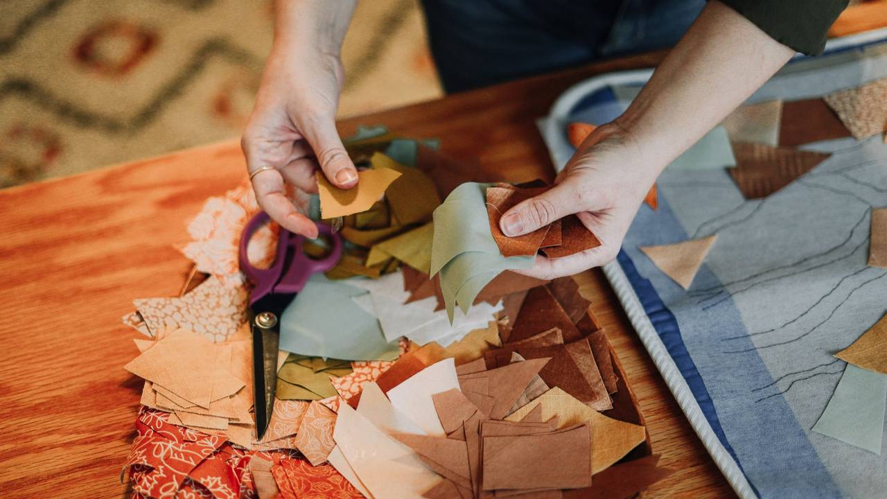
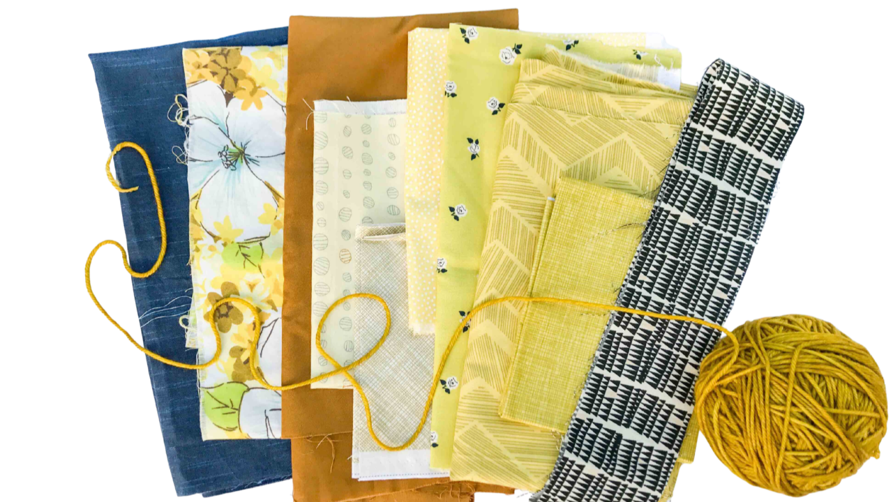
So the next time you're pulling fabric, you don't have to agonize. You get to play. Start with a color you love, keep your tones in a similar range, and then ask yourself one question: how much harmony or contrast do I want here? Pull colors close together on the wheel for a calm, cohesive feel, or spread them out for pop and energy.
That's the trick. No memorizing complicated color theory, no rules to get "right." Just one idea (any hue can go with any hue) and one question (harmony or contrast?) — and suddenly, color is something you can actually have fun with.
Have fun with it, and make it your own.
Want to dive in even deeper?
This is exactly what my brand-new FREE class is all about.
In Find Your Color Style, I’ll walk you through the whole framework — including the one “dial” that makes every palette decision easier — and you’ll leave with your personal color style named, in writing.
Three times to choose from:


Responses