How to Mix Prints in your Quilts -- The "Bette Midler Print" Technique
Jul 22, 2026Have you ever fallen head-over-heels for a fabulous print at the quilt shop — brought it home, petted it, admired it… and then never used it, because you couldn’t figure out what on earth to pair it with?
You are in very good company. Prints add so much interest and personality to a quilt, but with so many kinds of prints out there, mixing them can feel overwhelming. So let me hand you my favorite way to think about it — a little framework I’ve been teaching for years that quilters tell me they never forget.
First, one ground rule: there is no right or wrong way to mix prints. Truly. It all comes down to your personal taste and the look YOU want. (Sound familiar? It’s the same thing I always say about color — because it’s always true.)
It starts with scale
When we talk about the scale of a print, we’re talking about the size of the designs on the fabric. Are they tiny polka dots or big, giant flowers? The very same flower design scaled teeny-tiny reads completely differently than it does blown up large — and it creates a completely different effect in your quilt.
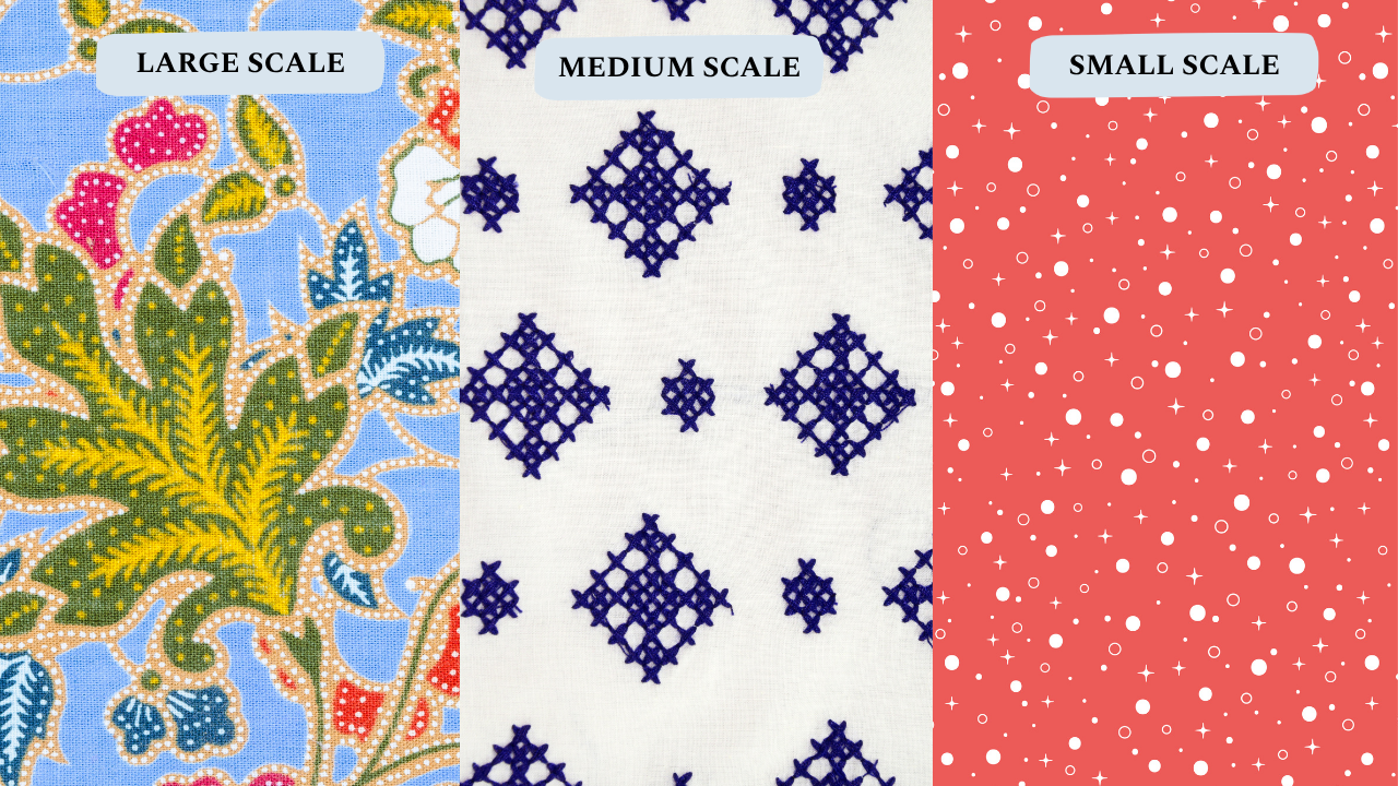
Scale is relative, but here’s a handy reference: small-scale prints have designs smaller than about an inch. Medium-scale prints sit between one and three inches. Large-scale prints are three inches and up. And solids? Solids have no scale at all — they’re pure blocks of color that give your eye a place to rest.
Each scale behaves differently in a quilt. Small prints, seen from a distance, almost read as solids — blur your eyes and they melt into lovely texture. They let the color and the quilt design do the talking. Large prints are the opposite: your eye goes straight to them. They bring drama and interest — and they can absolutely steal the show.
Which brings me to Bette.
The Bette Midler Effect
Think about the prints in your quilt like a Broadway show.
The solids are the stage. The small-scale prints are the set decorations. The medium-scale prints are the backup dancers. And your large-scale prints? That’s Bette Midler — the dazzling, vivacious star in sequins and high heels who you simply cannot take your eyes off of.
Now: put Bette alone on a bare stage, and she’s still fabulous — but the show isn’t as grand as it could be, right? Give her the full production — a beautiful stage, gorgeous set decorations, backup dancers moving behind her — and suddenly she SHINES. Everything around her is there to show her off.
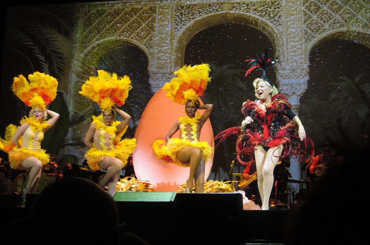
But pack that same stage with Cher, Madonna, and Liza Minnelli, all at the front, all in sequins, all with microphones? Now nobody quite gets to shine. It might be a wild, wonderful spectacle — and if that’s the look you love, go for it gloriously! — but if you want your star to stand out, she needs the stage to herself.

So next time you’re pulling fabric, try casting the show instead of matching the prints: Who’s my star? Who are my backup dancers? What’s my stage?
One question changes everything

Before you pull a single fabric, ask yourself: what do I want to emphasize — the design of my quilt, the fabrics themselves, or a balance of the two? There’s no wrong answer. It’s a creative choice, and it’s yours to make. That’s the whole fun of it.
 And here’s the bigger truth hiding underneath all of this: how you like to mix prints — quiet or bold, one diva or five — is part of your color style. It’s as personal as your handwriting… and most quilters have never named theirs.
That’s exactly what we’re doing in my free live class this week, Find Your Color Style. In one hour, you’ll name your personal color style — in writing — and start pulling palettes that look unmistakably like you. [If you’re reading this Wednesday: the next class is TOMORROW at 10am ET, with one more chance next Wednesday.]